GNW Creative Community
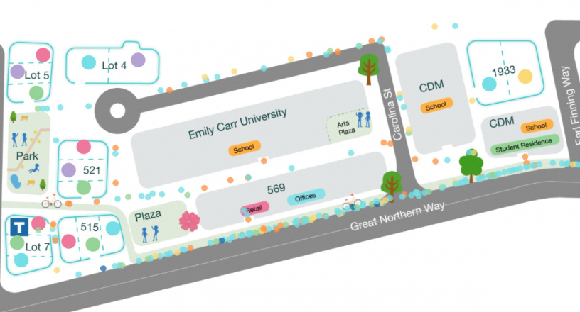
An interactive simulation of people flow to showcase the potential of PCI's real estate vision.
UX Designer, Developer
Java, Processing | 2017
1. Introduction
Challenge - Showcase the vibrancy of PCI's plan to the public
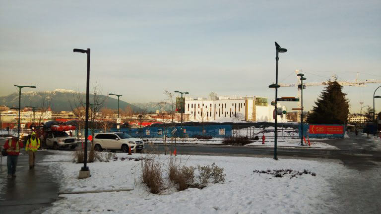
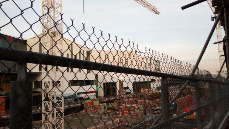
PCI, a real estate developer, has its vision for the Great Northern Way (GNW) Campus in Vancouver - that of a vibrant, energetic creative community. They wanted an innovative way to convey this vision to the public. For three months, I worked with a team of five to develop a solution for them. I designed and coded the look and behaviour of the people flow through the map.
Solution - A simulation for users to discover how PCI's plan brings more people to the area
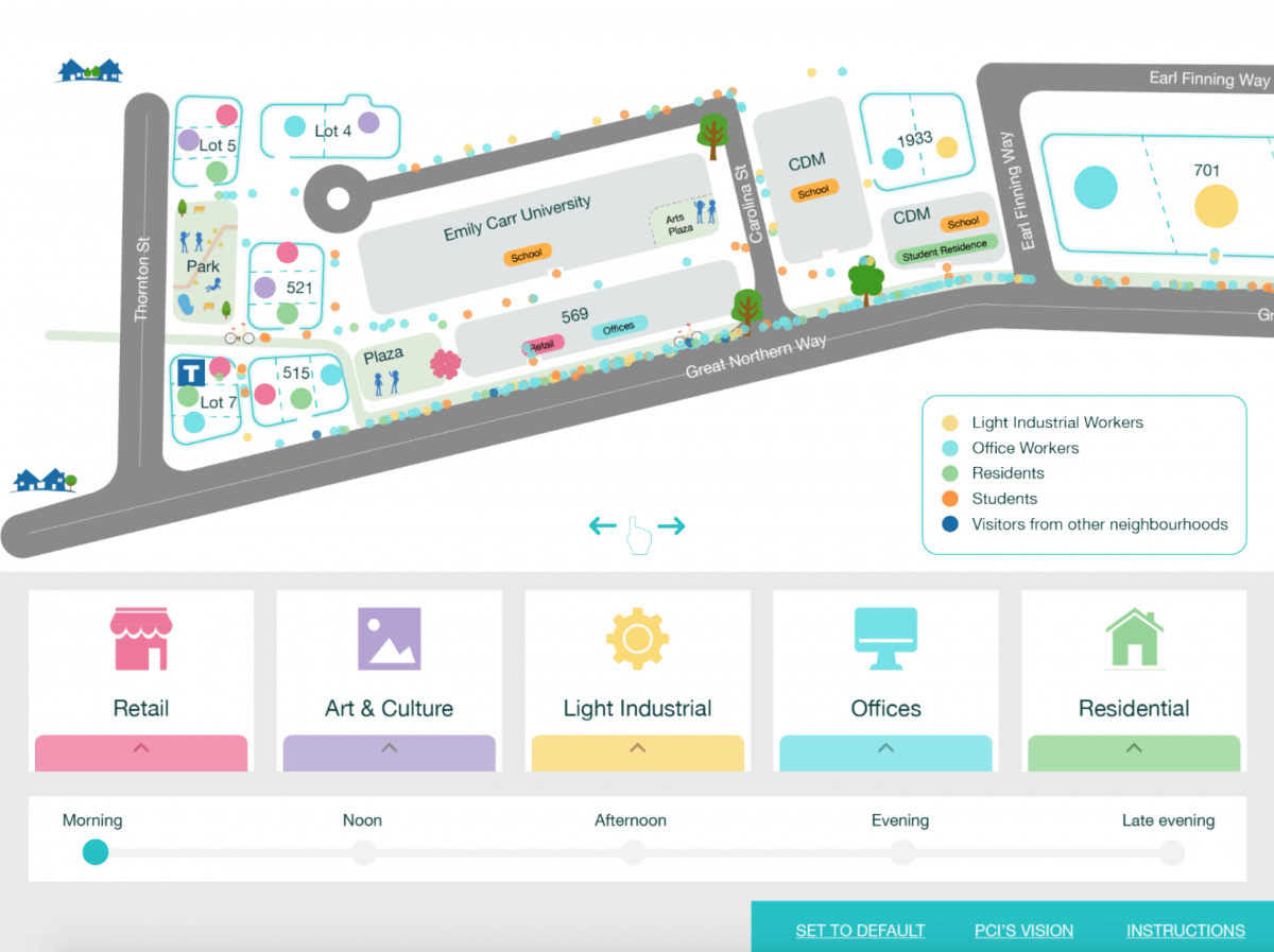
After rounds of brainstorming and exploring ideas, we decided that the final deliverable would take the form of an Android app that allows users to mix different types of buildings on a map and discover their impact. The area becomes truly vibrant when the mix of facilities matches PCI's real estate plan.
2. Research
User Research - Understanding the audience
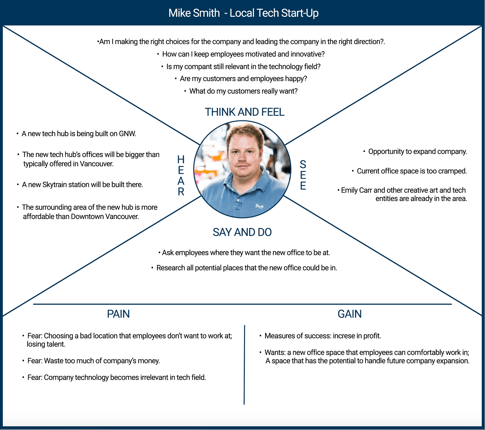
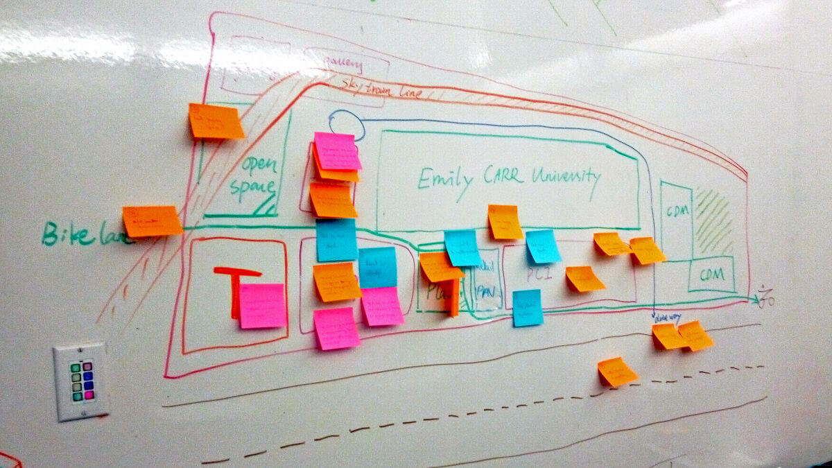
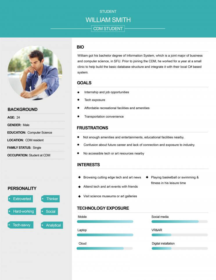
We wanted to build a media presentation that would leave a deep impression. The presentation had to resonate with the target audience. We first considered and analyzed their interests and potential concerns. To verify any assumptions, we interviewed people who were involved in public relations for GNW. With a better understanding of the audience, we mapped out the features of GNW that would be of most interest to them.

3. Prototyping
User testing - Finding the most effective solution
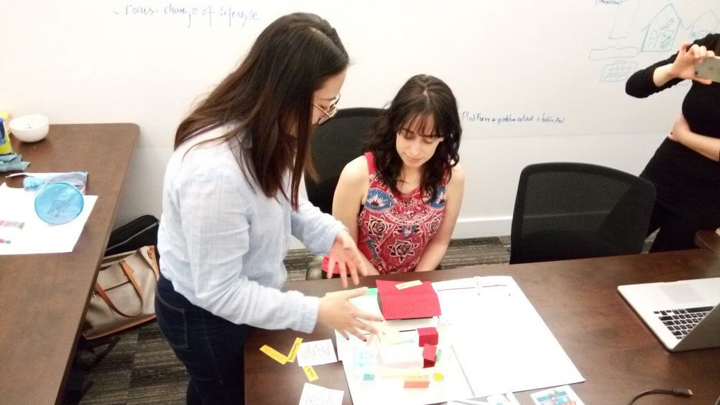
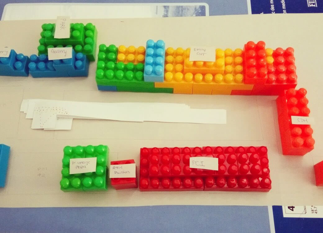
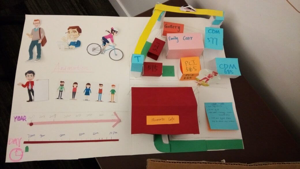
Our client wanted an interactive and innovative product, in line with their vision of a space that encouraged creatives and technologists to mix. Therefore, we drew inspiration not just from presentations in the field of architecture, but also museum exhibitions, games and experimental media artworks. We involved our client in the discussion and selected three concepts that were most suitable, and built low-fidelity versions of them for user testing. By observing the users' responses to the prototypes, we narrowed our choices down to the final concept.
Iterations - How to represent people flow?
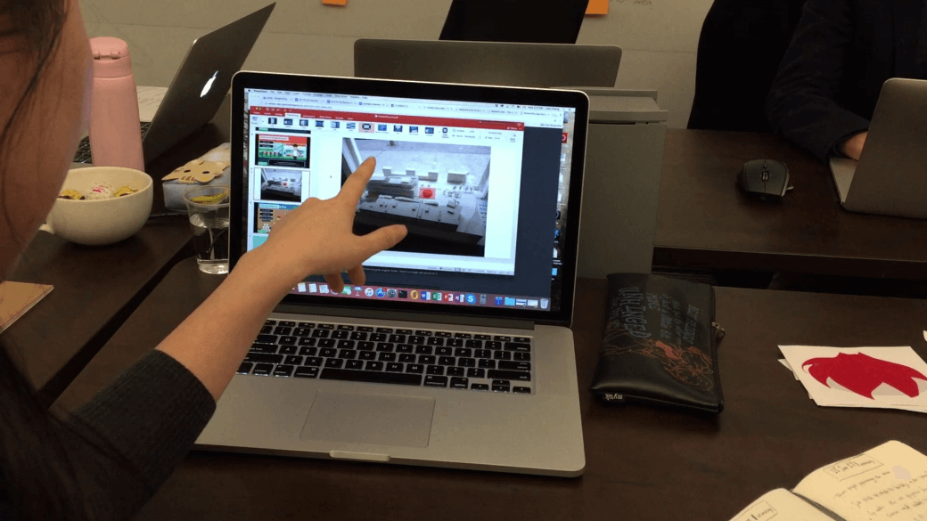
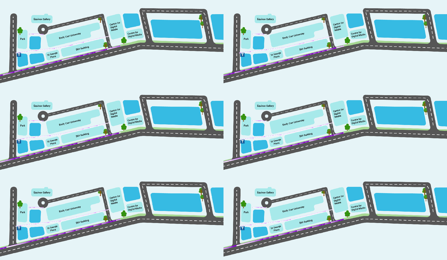
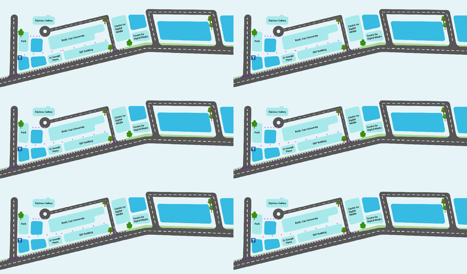
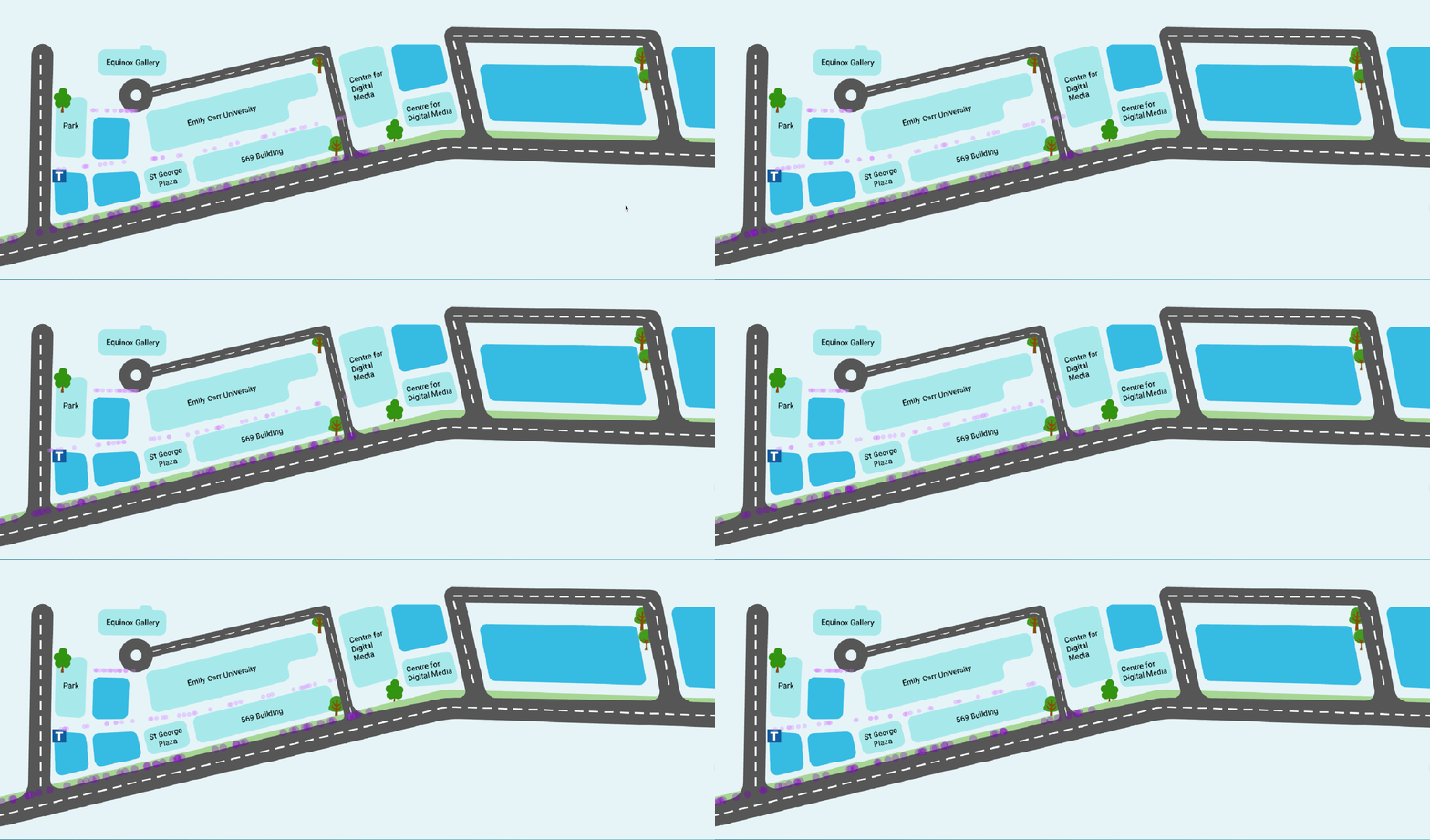
Our client was mainly interested to see how the people flow was designed and whether it would be able to convey their message. I took up the role of designing the flow. Making use of my skillsets in both animation and programming, I worked directly in code for the design, so as to ensure that our proposed animation worked as good as it looked. An important consideration was that the flow had to run smoothly on a tablet, which had lower processing power than a computer. Several versions of the flow were shown to users, and was improved on iteratively until it was obvious that it represented people. The look of the flow was also improved by using colours to represent different types of people, making it more interesting.
4. UI Considerations
Importance of 'affordances' - Making an intuitive interface
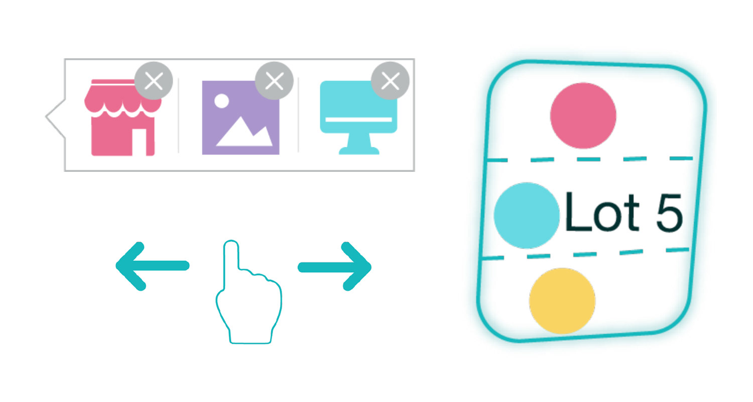
The intuitiveness of the app was another area we focused on. In our user tests, we found that many users skipped the instructions and wanted to try out how the app worked by themselves. Therefore, we had to design the app to be intuitive enough to use on its own. Details were carefully designed and added, such as having a blank background for customizable blocks and a finger swiping symbol to show that the map can be scrolled horizontally. As the screen estate was very limited on a tablet, we had to think carefully on how to make best use of the space to convey information, without cluttering up the interface.
5. Results
Our client was impressed when we presented the final product to them. It was an app that they could use immediately, and had successfully met their needs.
"ARCH was a pleasure to work with to develop the GNW Community planning tool. The app’s ability to clearly and flexibly demonstrate PCI’s vision and the many land use scenarios in the new community has been – and continues to be – well-received when presented to local stakeholders. The successful reception and the immediate engagement with this interactive visioning technology was made possible through the combination of creativity, innovation, technical expertise and focused project management that ARCH brought to the project. We are proud of what ARCH delivered."
- Christina Chan, PCI Developments Corp.
_
For more in-depth details, you can read the week-to-week log of our project's process in our team blog.
Contact me at vivieatto@gmail.com.
Made with ❤ using Blocs.
