Barter Aye
Second-hand marketplace that features a unique method of offering items through an innovative trading deck.
Startup, UX & UI Designer
Software: Sketch, Adobe Illustrator, InVision, Framer | 2017-2020
1. Introduction
a bartering Platform that saves money, and reduces waste
Barter Bay Exchange Inc is a startup company based in Vancouver, Canada that was established in 2017 with a team of 5. I am the sole designer in the team. With the rampant usage of smartphones, we wondered what if people could put their unused items over the internet. Someone might have a use for it, and be willing to give up something in return. It is also good for the environment - Instead of throwing things away, the items can get a second lease of life. One man’s trash is another man’s treasure.
This is the idea behind Barter Aye (formerly known as Barter Bay), a trading platform that we launched in February 2018 throughout North America. Within the first year of launch, we had more than 10,000 downloads on the App Store and Google Play.

From October to December 2017, the team worked on developing the core features of our app, testing different ideas and flow. Each of our team members contributed ideas, and I helped to visualize them to make sure everyone is on the same page.
This was done iteratively with increasingly high fidelity. I started with paper prototypes to quickly mock up our ideas to base for discussion. We refined our ideas, always keeping in mind our vision for the app.
To give an idea for the process, I will explain the prototypes of the unique feature of the app - the trading deck.
2. Exploration and Prototyping
Prototyping A new trading deck concept
Most existing buy and sell apps focus on individual goods, while we wanted to encourage our users to exchange items with each other. Thus, we drew on the idea of traditional bartering to come up with the concept of the trading deck, which is completely new to the second-hand market.
The trading deck is a page where users can see all items from themselves and their trading partner, and be able to suggest to the other party which items they wanted to offer. The other party would receive the offer, and then either accept it, or make another suggestion.
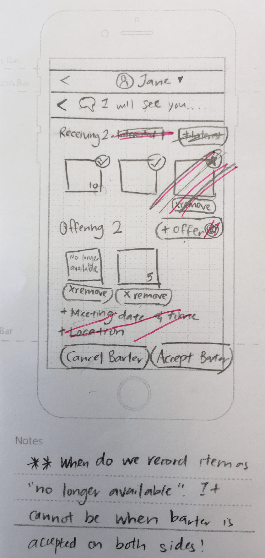
Low-fi prototype - 'Confirmed' vs 'interested' items
As this was a new concept, I started with a low-fidelity prototype to test out our concept and iron out the details. I started by using a star to distinguish between items that were confirmed by both parties, and those that were wanted by the other party but have not been confirmed ("interested" items). However, this proved to be confusing.
Second iteration - Drag and drop items to take action on them
I took away the 'interested' indicator, and instead used a red dot telling the user which items they needed to take action on. They could drag and drop the items to one of two relevant options in order to take action. There were two carousels to show the items of both parties, so that it would be easy to look through the items that can be exchanged. Items in the carousel can be dragged onto the slots to add them into the trade.
The carousel started as a vertical bar, which I later changed to a horizontal bar to accommodate more items. Having more than one dragging action made it easy to make errors, so we changed the drag-and-drop mechanic to tap selection. Subsequently, we decided that drag-and-drop actions were uncommon for apps outside of games, so we decided to change the mechanics for the trading slots.
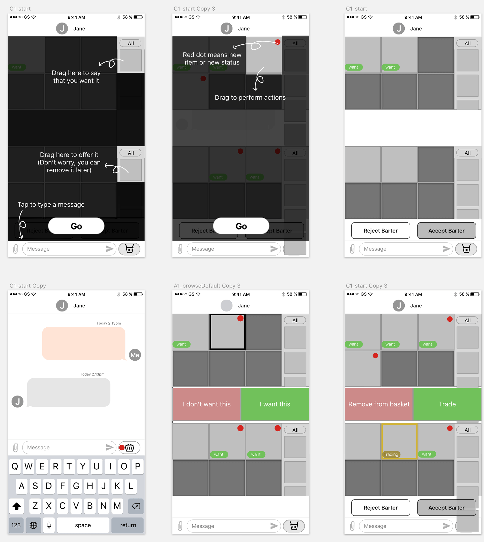
Second iteration with vertical carousel
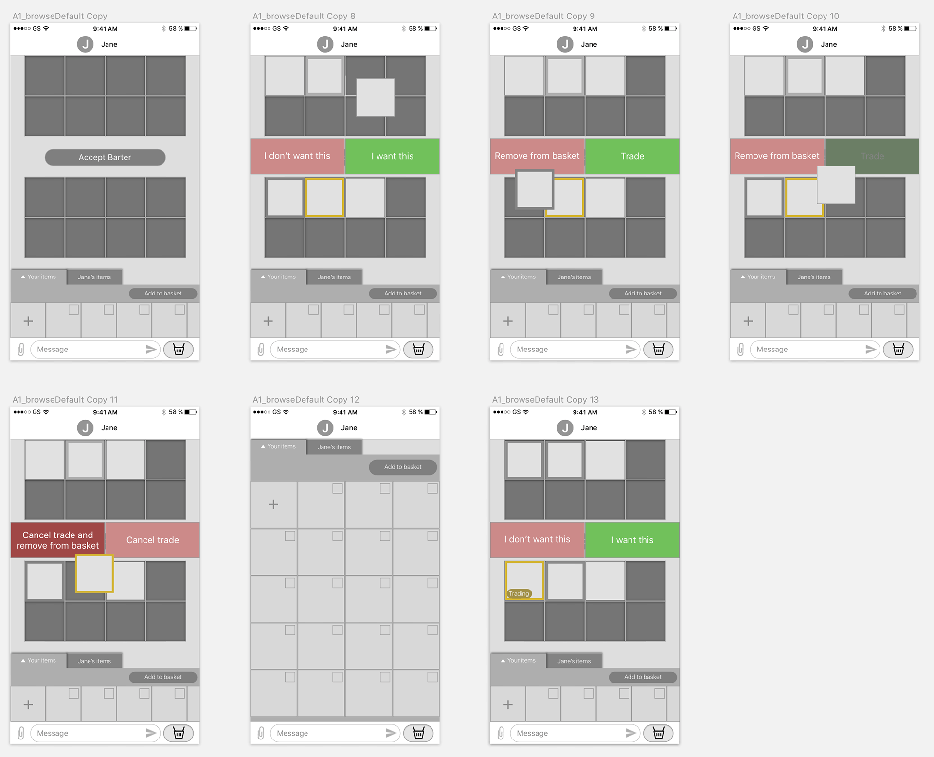
Second iteration with horizontal carousel
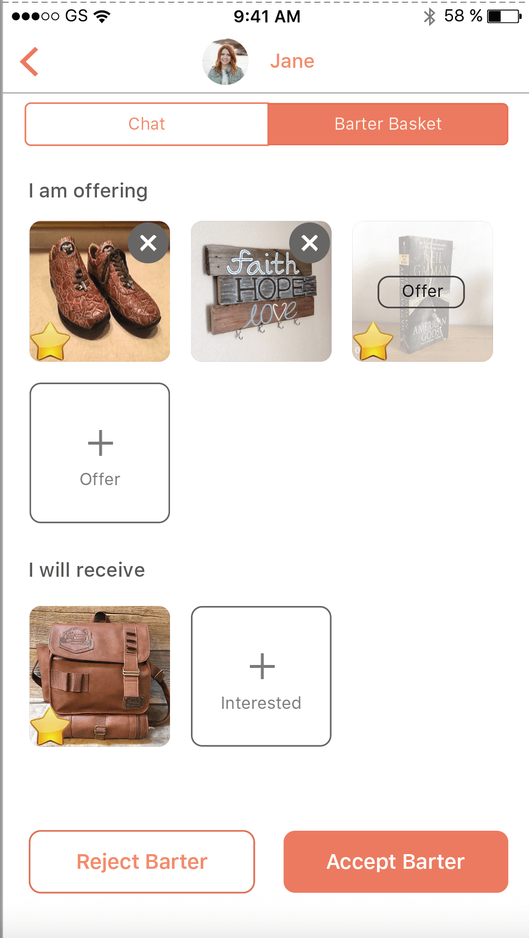
Finalized concept - Using both trading deck and chat to make back-and-forth offers
To simplify the trading deck further, I decided to take a different approach and minimize the number of actions that can be taken on that screen. This gave rise to a turn-based approach where one party makes an offer for the items to trade. The other party receiving an offer can either accept the trade, or make a new offer. In this case, the trading decks for both parties will always look the same, thus reducing the room for error and confusion. User testing was carried out with this concept, and it was a success - all of the testers could use the trading deck correctly without any additional prompts.
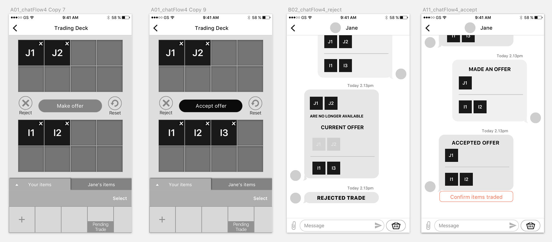
Final concept - Making and accepting offers through the trading deck and the chat
3. Design Specs Sheets
DESIGN SPECS SHEETS DETAILING INTERACTIONS
After confirming all the features of the app and how each screen would flow to the other, I created specs sheets for the final flow, detailing all interactions of the app. This sheet was referenced by the developers as they worked on the skeleton of the app.
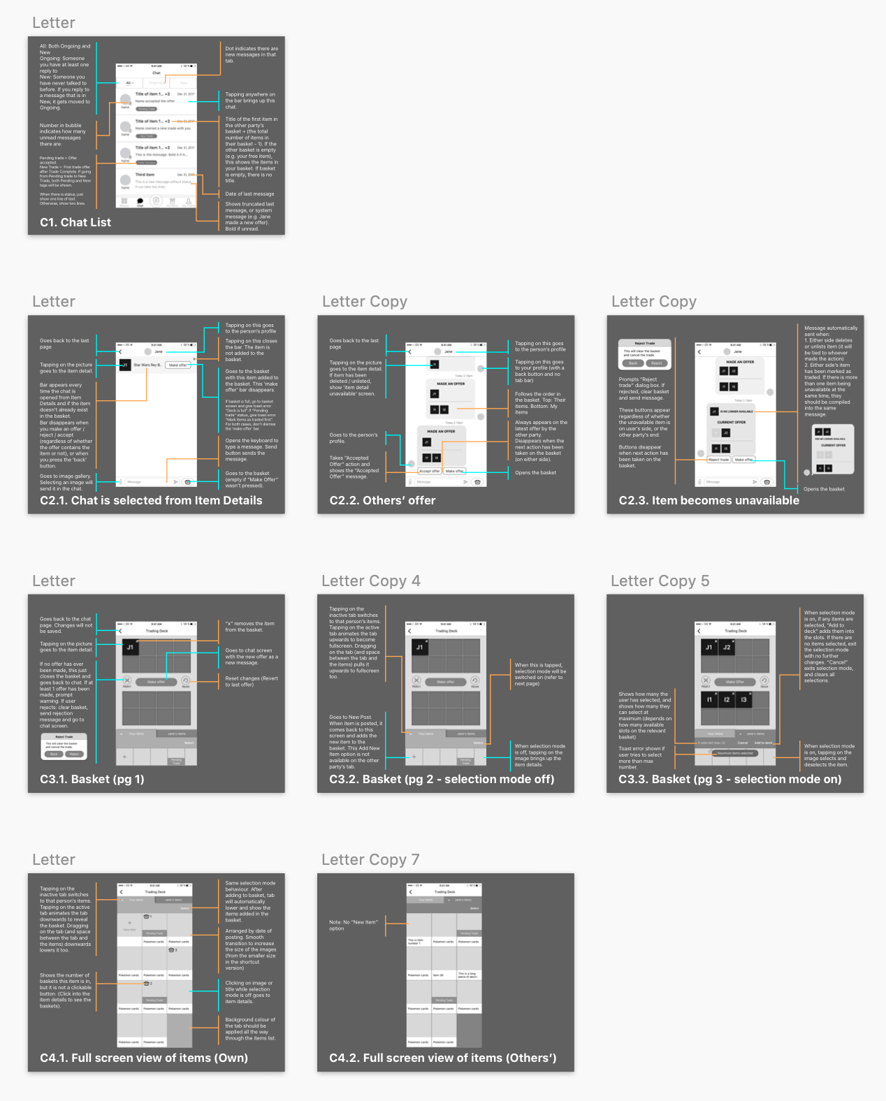
The specs sheets also helped me to write up the test cases for the app before we launched, I detailed every interaction possible on a spreadsheet. There were more than 600 rows of interactions available. We tested cases for both iOS and Android, and on different screen sizes.
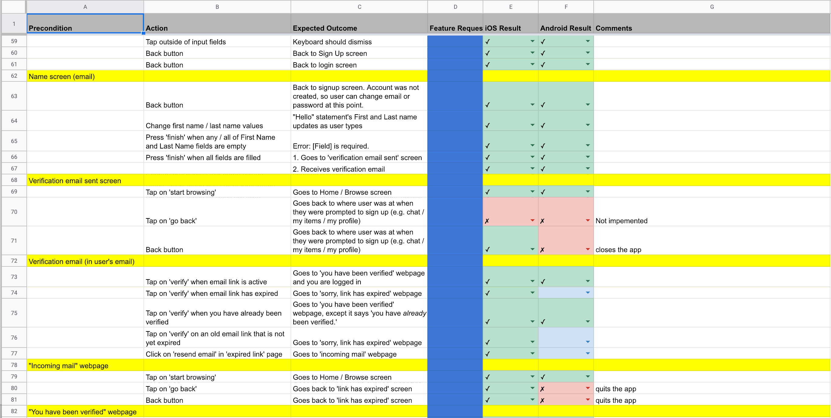
Some of the test cases in the spreadsheet
One challenge we faced was to get consistent behavior across Android and iOS platforms. There were a number of instances where what worked for one platform didn’t work for the other. I worked closely with the developers to tweak the design to find a workaround that still provided a good experience for both targeted platforms.
While the devs were working on the flow, I composed the look of each screen, selecting sizes, colours, fonts and creating all the icons.
4. Branding and Logo
UI Design - Finding the brand of Barter Bay
Orange as the main colour

Colours we considered for representing Barter Bay
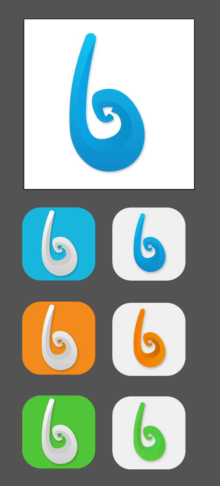
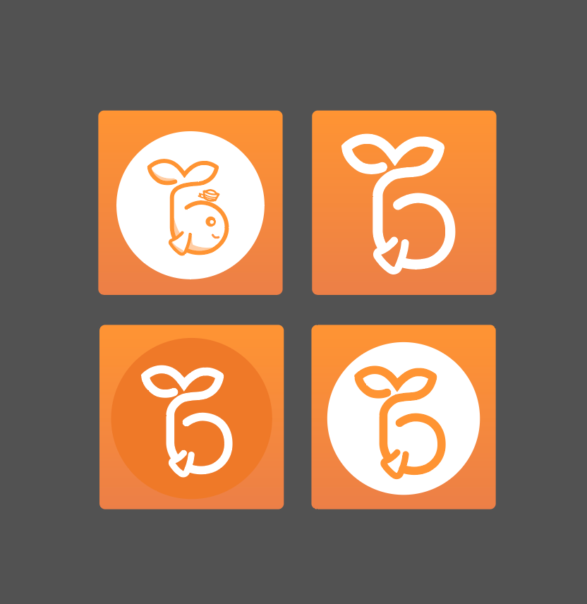
Logo Design
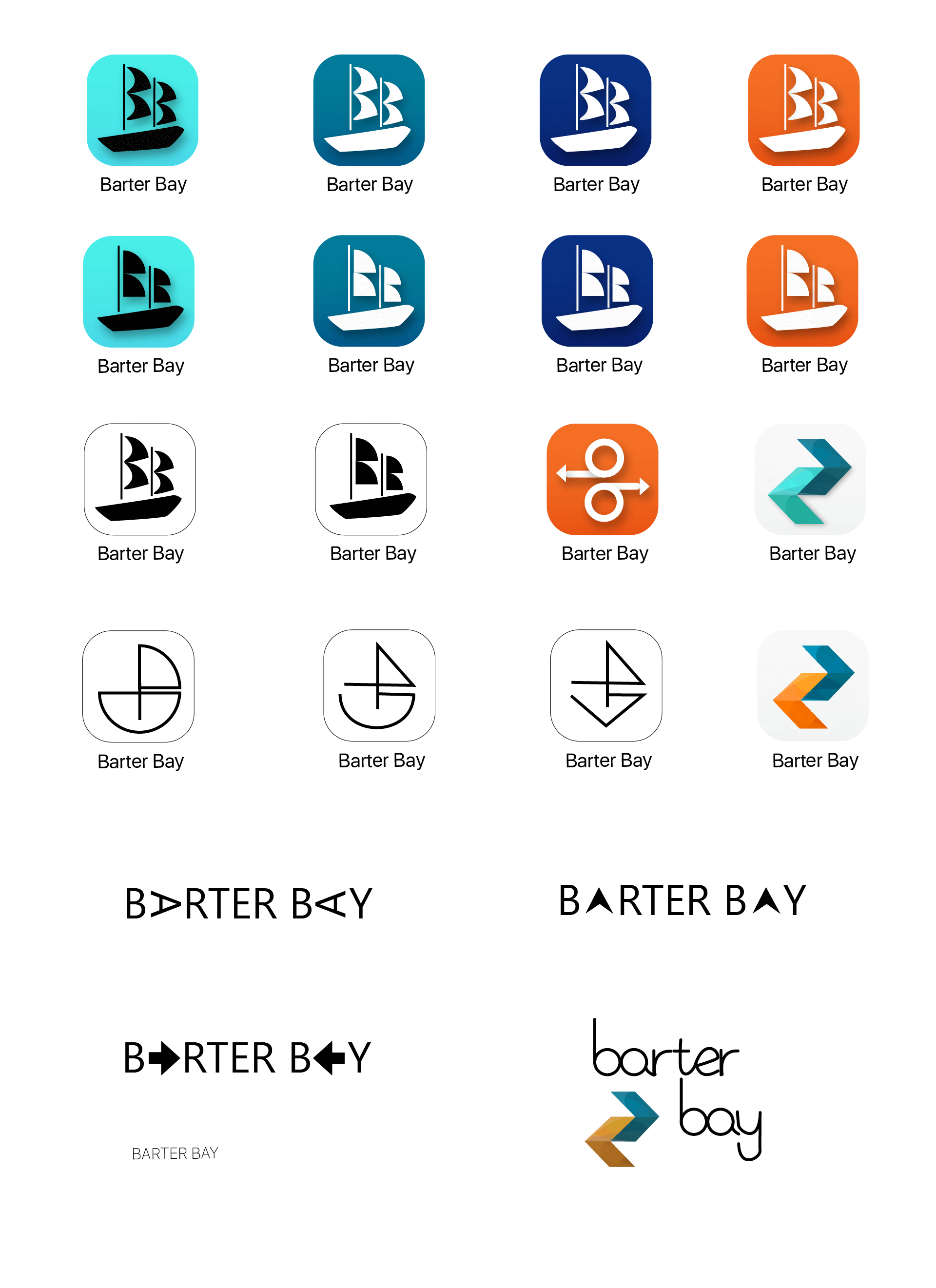
The inspiration for the final concept was based on the shape of a real bay, and the shape of the Hei Matau, a fish hook symbol which stands for strength and good luck. Both are shaped like the lowercase "b". The stylized whale also means good luck and friendliness, while its tail is shaped like a seedling, symbolizing Barter Bay's dedication to the environment.
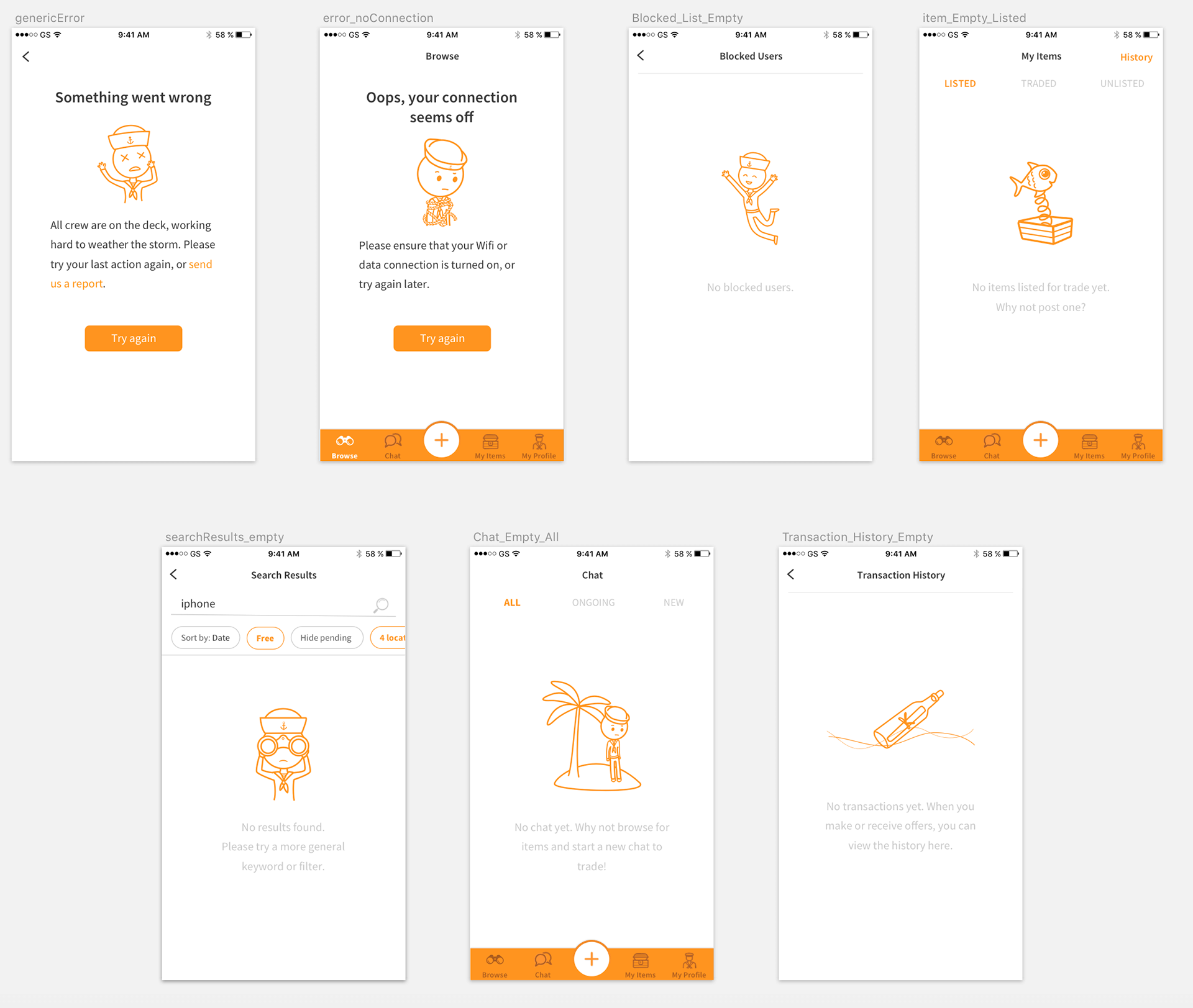
Barter Bay characters
5. UI Design
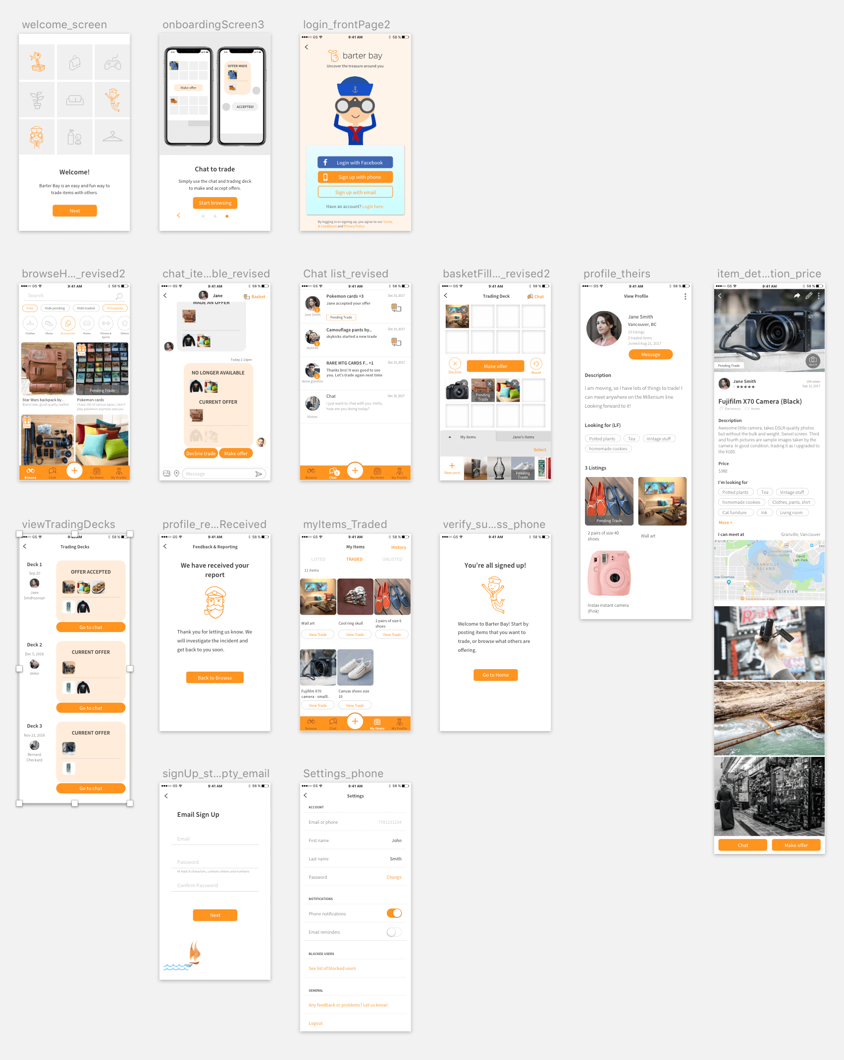
Applying the art style to screens
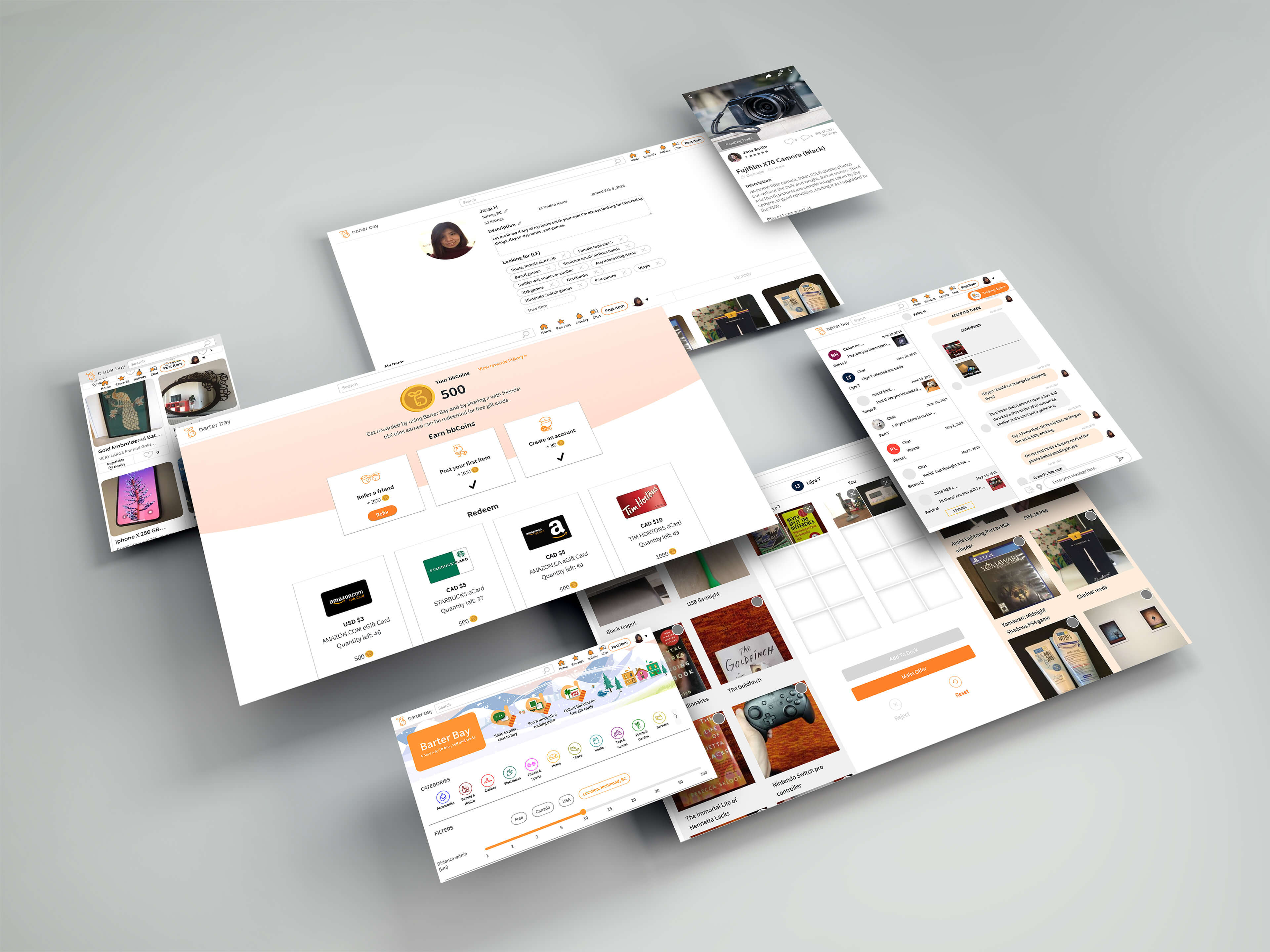
Barter Bay website
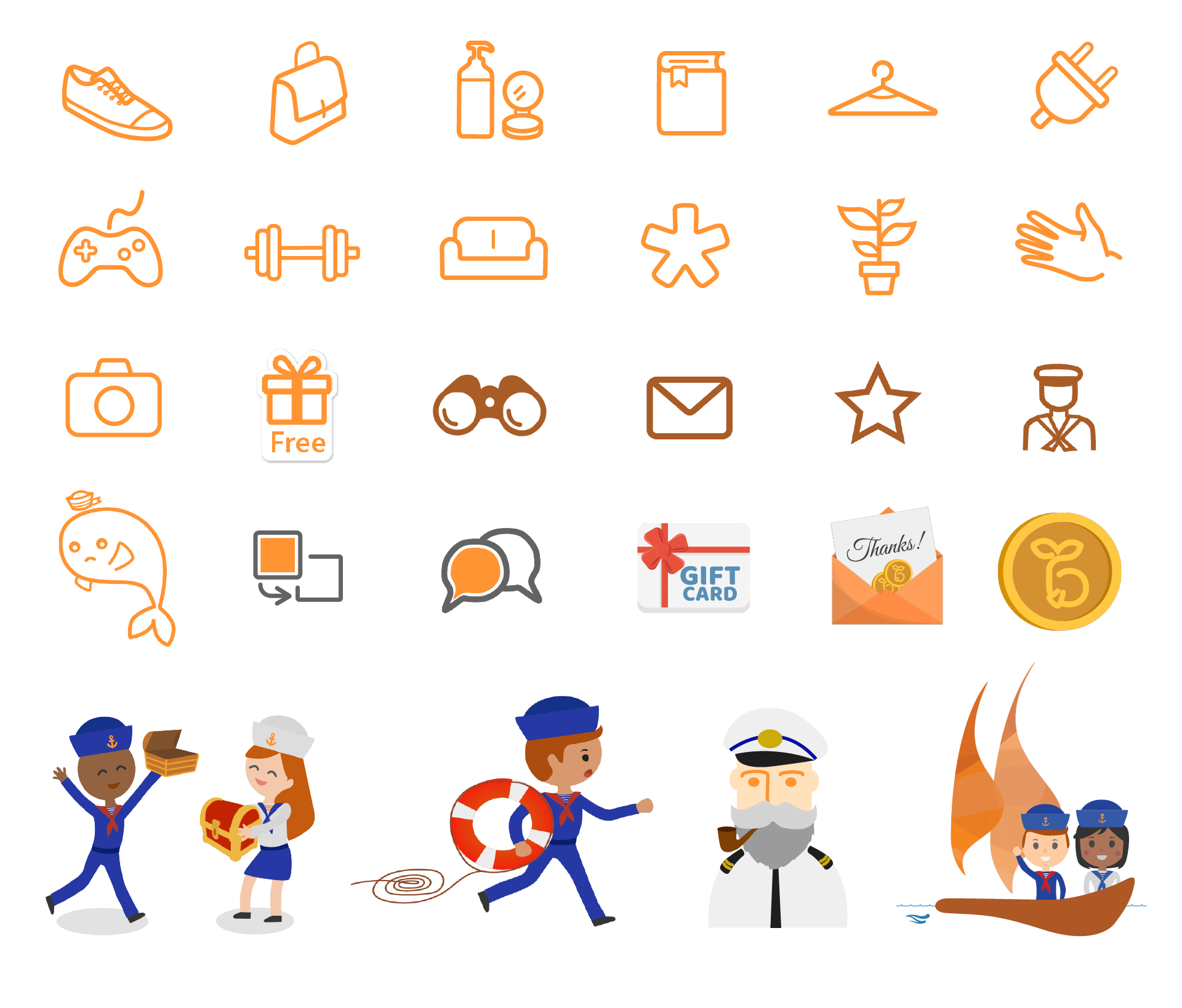
Custom icons and illustrations


6. Feedback and Improvements
Charts and quantitative data
We logged important user behaviour, such as number of chat messages sent, sign up rate, button presses and page views. This allowed us to infer where users had difficulty navigating.
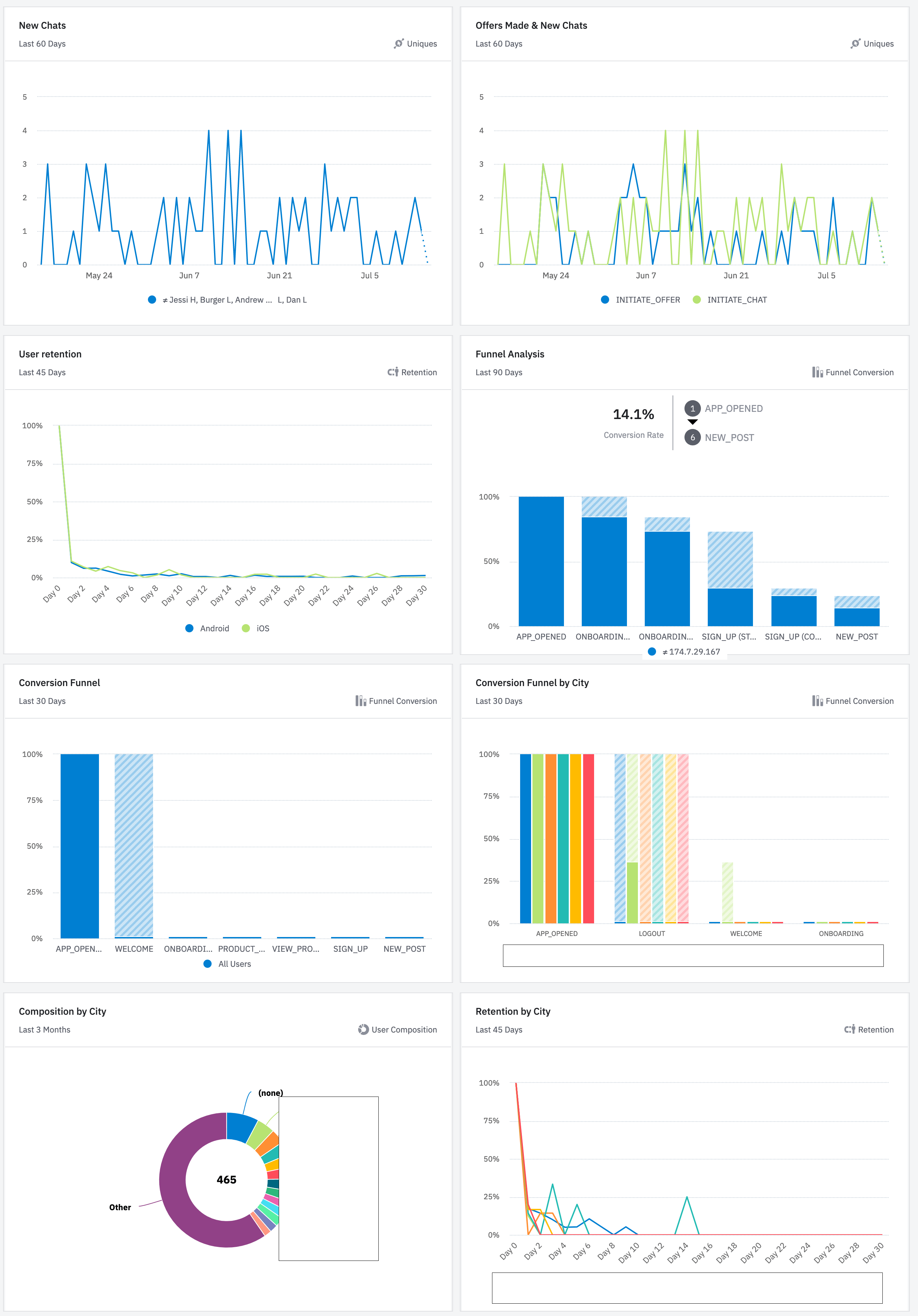
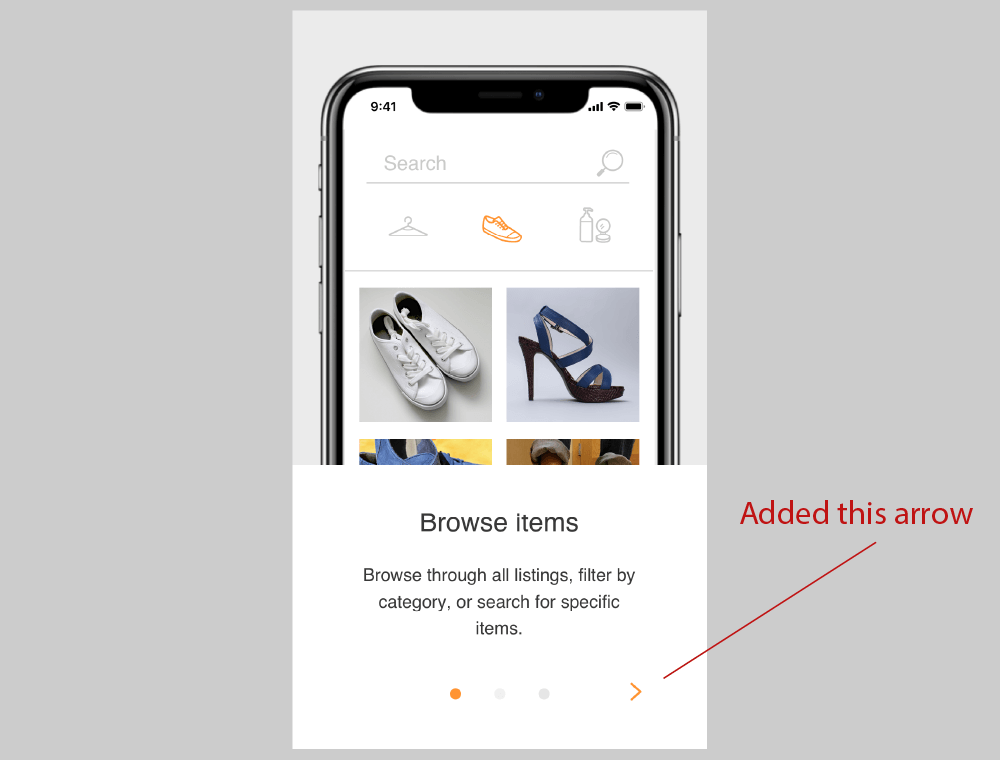
For example, I noticed early on from our funnel analysis that a significant number of users did not go further than the first screen of the onboarding process. I speculated that some of our users did not know that they could swipe to get to the next screen. It was likely that the dots we had at the bottom of the screen to indicate progress was not a good enough indicator. I added simple arrow buttons on our onboarding screens. Sure enough, the drop-off rate decreased.
Direct feedback from users
We noticed a number of people commenting about the number of items available in their location, so we made it a priority to develop GPS and distance measuring features to help the users see at a glance which items were closer to them.
As a team, we also continually check our list of future features and prioritize them based on impact and time needed to implement, in order to improve the product for our users.
_
Barter Bay is now known as Barter Aye, and it is still being actively developed. It is available in Canada and the US for the Android and iOS platforms, and on barteraye.com.
Contact me at vivieatto@gmail.com.
Made with ❤ using Blocs.
